

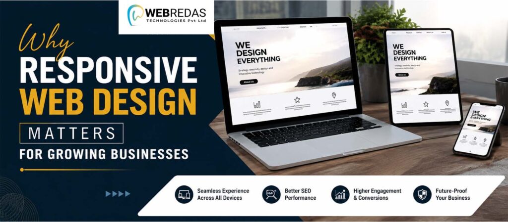
A business website is usually the first place where possible customers meet the brand. Since people are going online using smartphones, tablets, laptops, and desktops, companies really need a digital presence that functions neatly across different screen sizes. Responsive web design makes it easier to keep a steady browsing experience, while also adjusting to the shifting requirements of today’s customers.
What Is Responsive Web Design?
Responsive web design lets a website adjust layout and content depending on the device you’re on. Rather than building separate versions for each screen size, responsive sites are planned to keep a comfortable viewing experience for tablets, phones, and even desktops too. It means everything can shift in a more adaptable way, so the pages do not feel cramped or awkward.
Menus, images, text, buttons, and other elements can automatically adjust themselves to different screen dimensions, so the website becomes easier to navigate.
Improving the User Experience
Visitors are often more willing to explore a website when the pages are easy to read, and the path through it feels clear. But if the same site looks great on a desktop monitor while being hard to use on a smartphone, it can quickly turn people away and discourage potential customers, even before they get what they need.
Responsive design makes the content stay readable, helps ensure navigation is easy to reach, and keeps the buttons properly placed across different screens. It feels more fluent for visitors, so they can interact with the website in a more comfortable way, without the layout looking weird.
Reaching Mobile Users
Mobile browsing has turned into an important part of everyday internet life. Customers might search for products, compare services, read reviews, or even reach out to businesses straight away from their smartphones.
A responsive website helps businesses show their information well on mobile viewers without degrading the overall experience, because the layout adapts as needed. In other words, it keeps everything aligned, and you get a consistent look even on small screens.
Supporting Search Visibility
Website usability can also affect how easily people stumble upon a business online. Search engines look at things tied to phone friendliness and the overall page experience when they are trying to judge websites. If pages feel awkward on a mobile screen, or take too long to load, then discovery can become less simple.
A responsive webpage can make it easier for users to reach the content no matter what device they are using, which supports a more consistent digital presence, even if the screen size is different.
Making Future Updates Easier
Responsive websites are made for flexibility. As new devices and screen sizes keep showing up, a layout that is responsive can adjust more effectively than a website built around just one screen format. That often also helps with later maintenance, and updates become easier to manage over time.
Working with a reputable web development company in Kolkata can help companies improve their online presence by building a website that is both useful and flexible.
Building a Professional Brand Image
A site that works smoothly across devices can give a bit more of a stronger impression of professionalism and real dependability. When the branding stays consistent, the layout is clear, navigation is fast, and the content is easy to access, businesses can communicate their identity more effectively. These minor details can have an impact on how potential buyers view a brand.
When businesses focus on usability, flexibility, mobile access, and a steady brand image, they can end up with websites that help their growth last longer. A reputable web development firm can assist companies in creating responsive websites that support their objectives and offer a smoother user experience.